The HUB Bridgehampton Art Gallery · Artist Spotlight
Jo Jerusalem: Pop Icons, Painted Words, and the Energy of the Street

Two canvases bring the visual worlds of celebrity, fashion, and music into a vivid exchange between image and language. Marilyn Monroe wrapped in fashion’s monogram and Price, a music legend haloed in flame — show how the New York artist Jo Jerusalem turns world famous faces into new street-level declarations
Some portraits ask you to look. Jo Jerusalem’s portraits talk back. A familiar face can command attention before a viewer has read a single word. In the two Jo Jerusalem works presented at The HUB Bridgehampton Art Gallery, recognition is only the beginning. Marilyn Monroe Life Is Gucci and Prince With the Power of Soul Anythin’ Is Possible — the New York–based artist pairs a crisp, graphic black-and-white portrait with hand-painted words. Then he lets the paint run. Drips fall from the letters, splatters scatter across the color, and thin looping lines cut over the faces. Portraits rendered in emphatic black and white meet saturated color, repeated symbols, and lettering that leaves its own trails across the canvas. The result feels half gallery portrait, half city wall. It is polished enough to hang above a sofa and loose enough to feel like it was finished minutes ago. Both works are presented at The HUB, the 6,000-square-foot destination at The HUB 2183 Montauk Highway, Bridgehampton, showcasing painting, photography, sculpture, mixed media, and street-influenced work under one roof. Jo Jerusalem’s canvases show how much range that last category can hold. What unites them is a confident formula: a legendary face, a phrase to live by, and paint that refuses to stay still. Together, they show how a face and a phrase can reinforce one another while loose marks complicate the clarity of both.
Explore Jo Jerusalem at The HUB →

The Artist’s Creative Approach
Known professionally as J.O. Jerusalem, the artist is based primarily in New York City. His official biography describes a practice spanning multiple media, an Upper West Side studio, and a substantial body of commissioned and custom work. His originals collection provides further context for his engagement with recognizable imagery and short, assertive statements. In the two canvases featured here, that approach becomes a clear relationship between defined shapes and freer gestures. The portraits are organized through broad areas of light and dark. Around them, drips, splatters, and thin looping lines create a less predictable rhythm. These different kinds of marks allow the subjects to remain visually legible within active, densely worked settings. The result draws on the immediacy of pop imagery and street-art lettering. Viewers can take in the central image quickly, then spend time following the smaller interruptions that make each surface distinct. His path to art was personal before it was professional. Raised by a single mother, and a single father himself from an early age, he found in art a refuge that kept his mind at ease through difficult years. According to his biography, responsibility and hustle became second nature. The turning point came with an invitation to show at Art Basel in Miami. He has since produced hundreds of commissions custom works, and was featured as a main event for Art Basel 2022 at the SLS Hotel. Beyond the studio, he supports charitable auctions and brings art education and materials to under-resourced inner-city schools. His originals catalog makes his central subject clear: cultural icons. Screen stars, musicians, and athletes recur, often paired with phrases drawn from fashion and street culture. The visual method, as seen in both canvases at The HUB:
- A graphic core. The central portrait is rendered in high-contrast black and white, with the flat, poster-like clarity of a stencil.
- A saturated field. Around it, bright color — pink, yellow, orange, red — glows like light behind a figure on stage.
- The written word. Hand-painted phrases in heavy, uneven capitals become part of the composition, not a caption beside it.
- Controlled chaos. Drips, splatters, and thin looping lines are layered over everything, giving the surface speed and spontaneity.
A Closer Look at the Featured Works
01 / Celebrity, Fashion & Gesture
Marilyn Monroe: Life Is Gucci — Glamour Interrupted
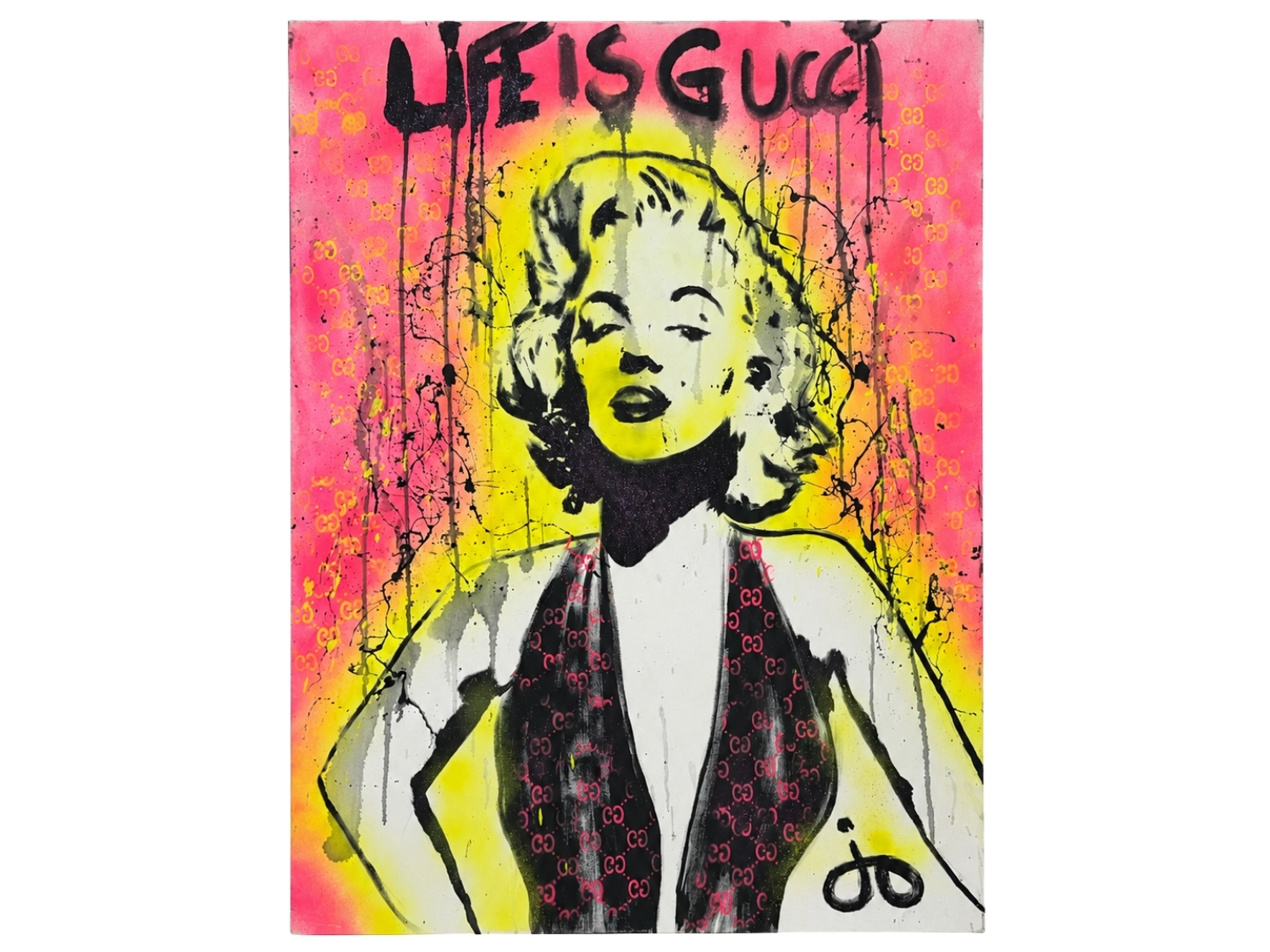
Hot pink establishes the outer field of Marilyn Monroe: Life Is Gucci, while a bright yellow area gathers around the figure. Against those colors, Monroe’s pale face and dark features become the composition’s anchor. The curls of her hair, the outline of her shoulders, and the deep shape of her halter dress give the portrait a strong vertical structure. The repeated Gucci motifs add another layer of organization. Small emblems appear across the background and within the dark dress, moving between decoration and recognizable branding. Their repetition creates a patterned rhythm behind and below the face, encouraging the eye to travel through the composition rather than remain fixed on the portrait alone. Across the top, the lettering acts as a second focal point. Its irregular edges and descending black drips introduce movement into the upper portion of the canvas. Finer splashes and wandering lines extend that activity along the sides, where they cross the bright color and complicate the figure’s outline. The portrait’s composed expression and the restless surrounding marks create a productive tension. Read as celebration, the work pairs Hollywood glamour with the visual language of luxury. Read more critically, it can prompt questions about how celebrity and branding become shorthand for desirability. Both possibilities emerge from the same concrete decisions: a familiar face, a repeated emblem, and an emphatic phrase.
02 / Music, Rhythm & Possibility
With the Power of Soul, Anythin’ Is Possible — A Portrait in Rhythm
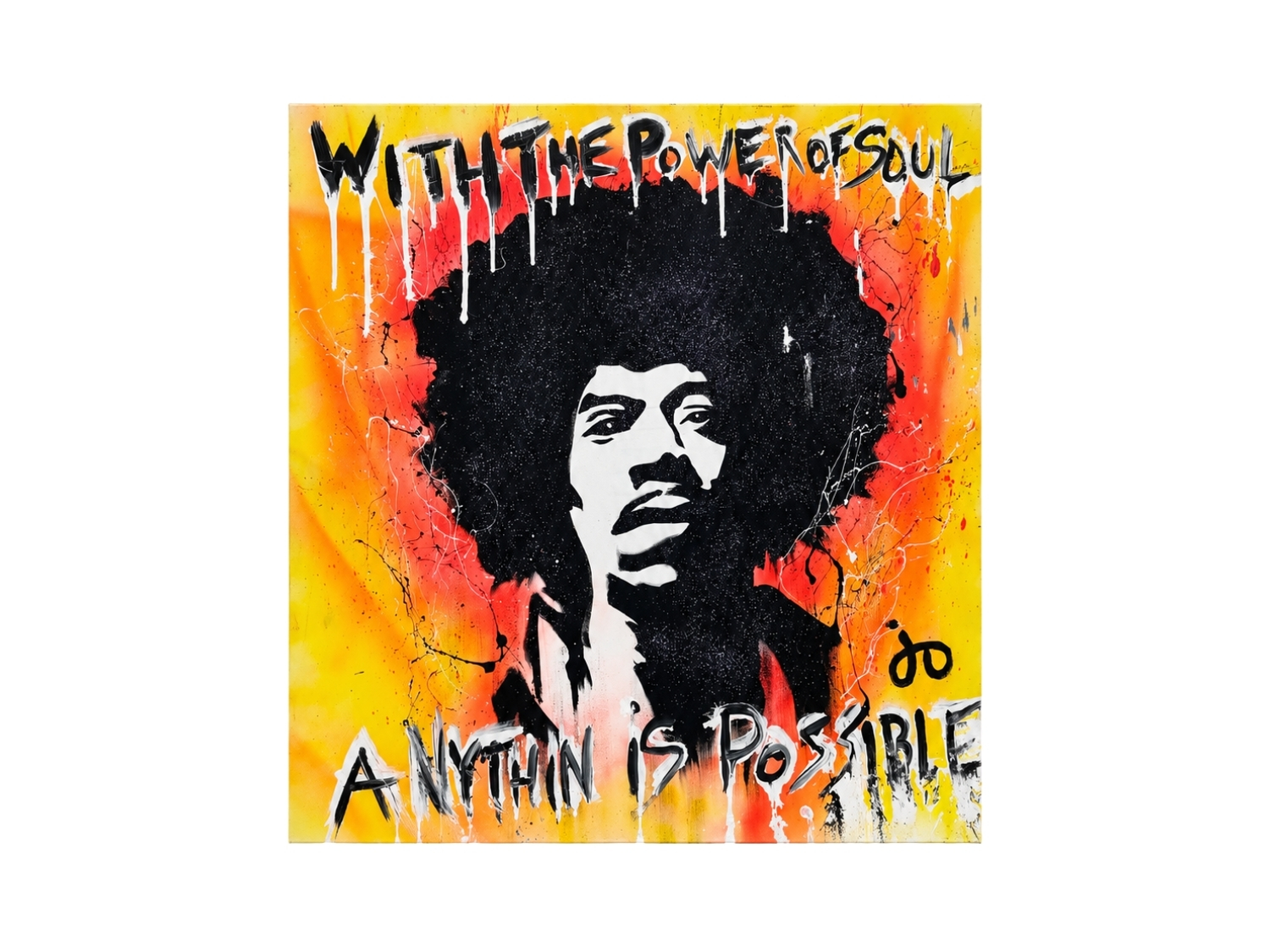
In the second canvas, a broad silhouette of black hair dominates the center, surrounded by yellow, orange, and coral red. The face emerges through sharply defined passages of white and black. Its concentrated light areas give the viewer a place to settle within a composition otherwise alive with contrasting marks. The painted message occupies both the upper and lower edges, forming verbal bookends around the portrait. Letters lean, stretch, and vary in height, introducing a rhythm that is visibly different from mechanically uniform type. White accents and long downward runs make the words part of the surrounding movement. Across the colored field, thin looping lines and scattered splashes interrupt the larger areas of paint. Their scale matters: fine marks register as quick visual accents beside the substantial dark shape at the center. The composition gains energy from that contrast between a commanding silhouette and small, unpredictable gestures. The warm colors and active surface can suggest the force of amplified sound or the momentum of a live performance. That is an interpretive association encouraged by the musical subject and the language of the inscription. The work gives its message a physical presence through placement, contrast, and movement, allowing the eye to experience some of the energy the words describe.
Connections Across the Works
Both paintings use contrast as a means of directing attention. Large dark forms establish the portraits; bright surrounding colors make those forms immediately visible; smaller marks keep the surfaces active. The lettering is integrated into this structure, occupying prominent areas and sending drips into the image below.
Here, words shape the composition as much as the portraits do.
The differences are equally important. In the Monroe canvas, recurring emblems create a relationship between a public image and the patterned language of fashion. In the music portrait, the expansive hair silhouette and the placement of text above and below the face give the work a more concentrated central weight. One invites the eye to move through repeated symbols; the other draws it toward a dominant shape before releasing it into the surrounding color. Seen together, the pieces demonstrate how a consistent visual vocabulary can support different moods. The first allows for glamour, wit, and questions about aspiration. The second turns toward intensity, expression, and possibility. Their individuality comes from the arrangement of familiar elements and the different kinds of movement those arrangements produce.
Discover Jo Jerusalem at The HUB
Explore these featured works at The HUB Bridgehampton Art Gallery and through the gallery’s Jo Jerusalem collection. From a distance, the portraits and lettering establish their impact. Closer attention reveals the repeated motifs, shifting edges, and fine marks that give each composition its character. Follow the individual check-out links for artwork details and purchase options, or explore the collection to begin an inquiry with The HUB.